One of the exciting aspects of aggregations are how easily they are converted into charts and graphs. In this chapter, we are focusing on various analytics that we can wring out of our example dataset. We will also demonstrate the types of charts aggregations can power.
aggregation의 가장 흥미로운 부분 중 하나는, 그것을 chart와 graph로 변경하기가 쉽다는 것이다. 이 장에서, 예제 데이터 집합에서 뽑아낼 수 있는 다양한 분석에 집중할 것이다. 또한 aggregation에서 가능한 chart aggregation의 유형들을 설명할 것이다.
The histogram bucket is particularly useful. Histograms are essentially bar charts, and if you’ve ever built a report or analytics dashboard, you undoubtedly had a few bar charts in it. The histogram works by specifying an interval. If we were histogramming sale prices, you might specify an interval of 20,000. This would create a new bucket every $20,000. Documents are then sorted into buckets.
histogram bucket은 특히 유용하다. histogram은 기본적으로 bar chart이다. 이전에 보고서나 분석용 대시보드를 만들어 보았다면, 아마도 그 안에 몇 개의 bar chart를 넣어 본 경험이 있을 것이다. histogram은 간격(interval)을 지정해야 한다. 판매가격을 bar chart로 만들어야 한다면, 간격을 20,000 으로 지정할 수 있다. 이렇게 하면, 매 $20,000 마다 새로운 bucket을 생성할 것이다. 그러면, document는 bucket에 정렬된다.
For our dashboard, we want to know how many cars sold in each price range. We would also like to know the total revenue generated by that price bracket. This is calculated by summing the price of each car sold in that interval.
대시보드에서 각 가격대 별로 판매된 자동차의 수를 알려고 한다. 또한, 가격대별로 총 매출을 알려고 한다. 이것은 해당 가격대에서 팔린 각 자동차 가격의 합으로 계산된다.
To do this, we use a histogram and a nested sum metric:
이를 위해, histogram 과 내장된 sum metric을 사용한다.
GET /cars/transactions/_search { "size" : 0, "aggs":{ "price":{ "histogram":{"field": "price", "interval": 20000 }, "aggs":{ "revenue": { "sum": {
"field" : "price" } } } } } }
|
|
|
|
As you can see, our query is built around the price aggregation, which contains a histogram bucket. This bucket requires a numeric field to calculate buckets on, and an interval size. The interval defines how "wide" each bucket is. An interval of 20000 means we will have the ranges [0-19999, 20000-39999, ...].
알겠지만, 이 query는 histogram bucket을 포함하는, price aggregation을 기준으로 만들어졌다. 이 bucket은 bucket을 계산할 숫자 field와, interval 크기가 필요하다. interval은 각 bucket의 "폭(wide)" 을 정의한다. 20,000 이라는 interval은 [0-19999, 20000-39999, ...] 의 범위를 가진다.
Next, we define a nested metric inside the histogram. This is a sum metric, which will sum up the price field from each document landing in that price range. This gives us the revenue for each price range, so we can see if our business makes more money from commodity or luxury cars.
그 다음에, histogram 내부에 충첩된 bucket을 정의하였다. 이것이, 해당 가격대에 포함되는 각 document에서 price field의 합을 나타내는, sum metric이다. 이것이 각 가격대의 매출이다. 그래서, 어떤 가격대의 자동차에서 더 많은 매출이 일어나는지를 알 수 있다.
And here is the response:
그리고 이것이 response이다.
{
...
   "aggregations": {
      "price": {
         "buckets": [
            {
               "key": 0,
               "doc_count": 3,
               "revenue": {
                  "value": 37000
               }
            },
            {
               "key": 20000,
               "doc_count": 4,
               "revenue": {
                  "value": 95000
               }
            },
            {
               "key": 80000,
               "doc_count": 1,
               "revenue": {
                  "value": 80000
               }
            }
         ]
      }
   }
}
The response is fairly self-explanatory, but it should be noted that the histogram keys correspond to the lower boundary of the interval. The key 0 means 0-19,999, the key 20000 means 20,000-39,999, and so forth.
response에 대해서 따로 설명할 필요는 없겠지만, histogram의 key는 interval의 하한에 해당한다는 점에 주목해야 한다. key 0 은 0-19,999, key 20000 은 20,000-39,999 등이다.
You’ll notice that empty intervals, such as $40,000-60,000, is missing in the response. The histogram bucket omits these by default, since it could lead to the unintended generation of potentially enormous output.
$40,000-60,000 같은 비어 있는 interval은 response에서 빠져있다는 점에 주목하자. 이들은 잠재적으로 의도하지 않은 엄청난 출력을 생성할 수 있기 때문에, histogram bucket은 이들을 기본적으로 생략한다.
We’ll discuss how to include empty buckets in the next section, Returning Empty Buckets.
비어 있는 bucket을 포함하는 방법은 다음의 Returning Empty Buckets에서 이야기할 것이다.
Graphically, you could represent the preceding data in the histogram shown in Figure 35, “가격대별 판매수와 매출”.
그래프로 위의 데이터를 histogram에 표시하면 Figure 35, “가격대별 판매수와 매출”과 같다.

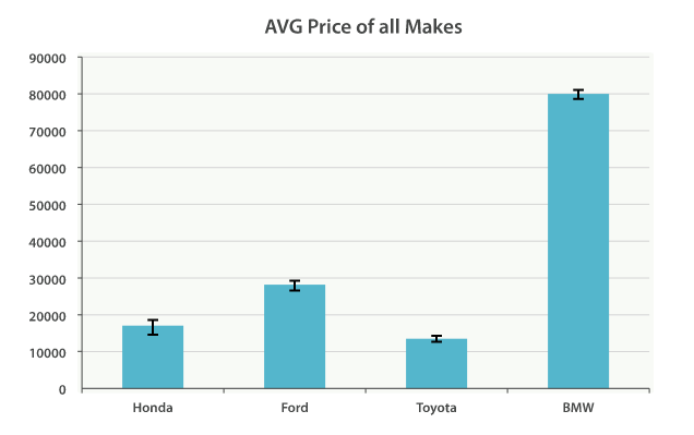
Of course, you can build bar charts with any aggregation that emits categories and statistics, not just the histogram bucket. Let’s build a bar chart of the top 10 most popular makes, and their average price, and then calculate the standard error to add error bars on our chart. This will use the termsbucket and an extended_stats metric:
물론, histogram bucket만이 아닌, 분류와 통계를 출력하는, 다른 aggregation을 통해 bar chart를 만들 수 있다. 가장 인기 있는 상위 10개의 제조업체, 그리고 그들의 평균가를 가지는 bar chart를 만들어 보자. 그리고 chart에 오차를 추가하기 위해, 표준오차를 계산한다. 이것은 terms bucket과 extended_stats metric을 사용할 것이다.
GET /cars/transactions/_search
{
  "size" : 0,
  "aggs": {
    "makes": {
      "terms": {
        "field": "make",
        "size": 10
      },
      "aggs": {
        "stats": {
          "extended_stats": {
            "field": "price"
          }
        }
      }
    }
  }
}
This will return a list of makes (sorted by popularity) and a variety of statistics about each. In particular, we are interested in stats.avg, stats.count, and stats.std_deviation. Using this information, we can calculate the standard error:
이 query는, 인기 순으로 정렬된, 제조 업체 목록과 각각에 대한 다양한 통계를 반환한다. 특히, stats.avg, stats.count, stats.std_deviation 가 흥미롭다. 이 정보를 사용하여, 표준오차를 계산할 수 있다.
std_err = std_deviation / count
This will allow us to build a chart like Figure 36, “표준 오차를 가진 모든 업체의 평균 가격”.
Figure 36, “표준 오차를 가진 모든 업체의 평균 가격”와 같은 chart를 만들 수 있다.
'2.X > 4. Aggregations' 카테고리의 다른 글
| 4-02-2. Buckets Inside Buckets (0) | 2017.09.24 |
|---|---|
| 4-02-3. One Final Modification (0) | 2017.09.24 |
| 4-04. Looking at Time (0) | 2017.09.24 |
| 4-04-1. Returning Empty Buckets (0) | 2017.09.24 |
| 4-04-2. Extended Example (0) | 2017.09.24 |